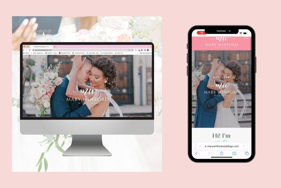
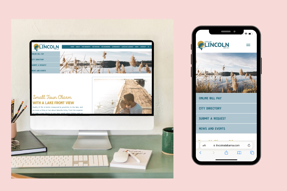
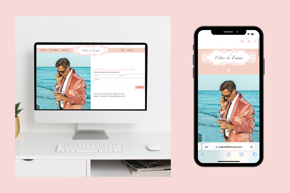
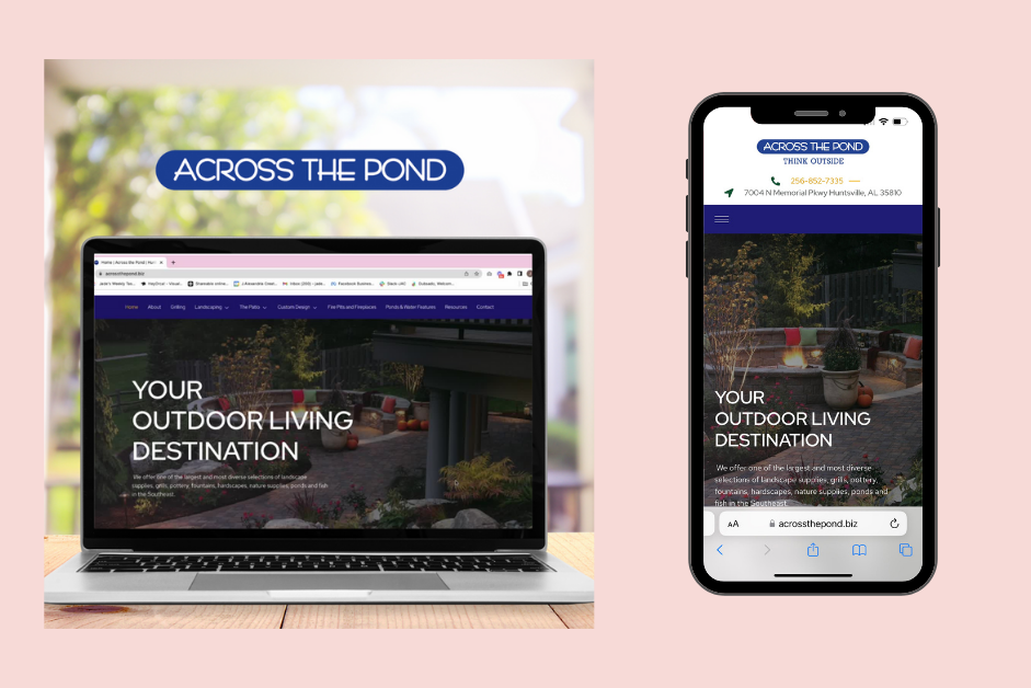
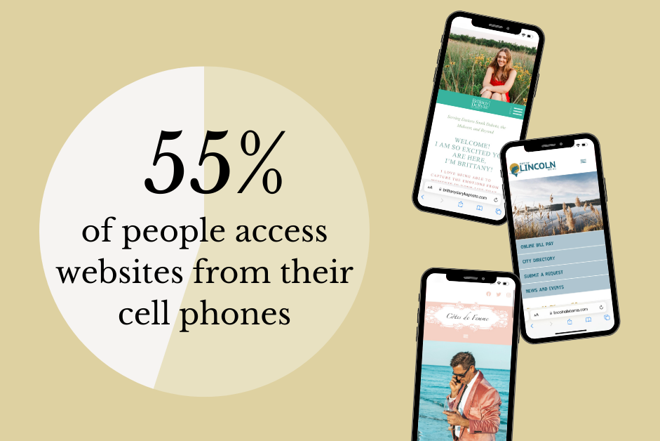
What does your mobile website look like? Did you know roughly 55% of internet users are browsing on mobile devices? This is why it’s so important to make sure your web design is great on all devices- desktop, tablet, and mobile 📱.
Good web experiences ➡️ Happy consumers
If you’re DIY-ing your pages, make sure to periodically check the other views in your website builder. Make sure the layout is working well on tablet/mobile! Check that all links are doing what they are supposed to do! ✅ Make sure the text is where it’s supposed to be. ✅ Check the site speed. ✅ Some builders are GREAT at their auto-generated website layouts. Our favorite builders for great mobile website customization are:
ShowIt
Squarespace
WordPress (with Elementor)
We totally understand if you have no time to DIY your website. If you work with our team on a custom website design or planning to DIY with one of our ShowIt Website Templates, no worries 🤗 All of our services come with a mobile version of your website so you don’t have to worry about a thing 👌🏼 We hope this information encourages you to take a closer look at the mobile view of your pages to make sure they are great.
Desktop vs. Mobile Website Design:
Make sure to follow us on social and contact us if you’re ready for my team to help you elevate your branding or website 🥰

comments +