
Bringing Morgan’s Vision to Life
When Morgan came to us, she was ready for a brand that felt like her. As the creative behind Orange Rose Photography, Morgan captures raw, emotive family moments—photos filled with connection, laughter, and perfectly imperfect memories. Yet, her online presence didn’t reflect that same authenticity. Inconsistencies in her branding and client experience left her craving a cohesive, professional identity that felt cozy, natural, and warm—just like her work.
Our Strategy for an Authentic Brand
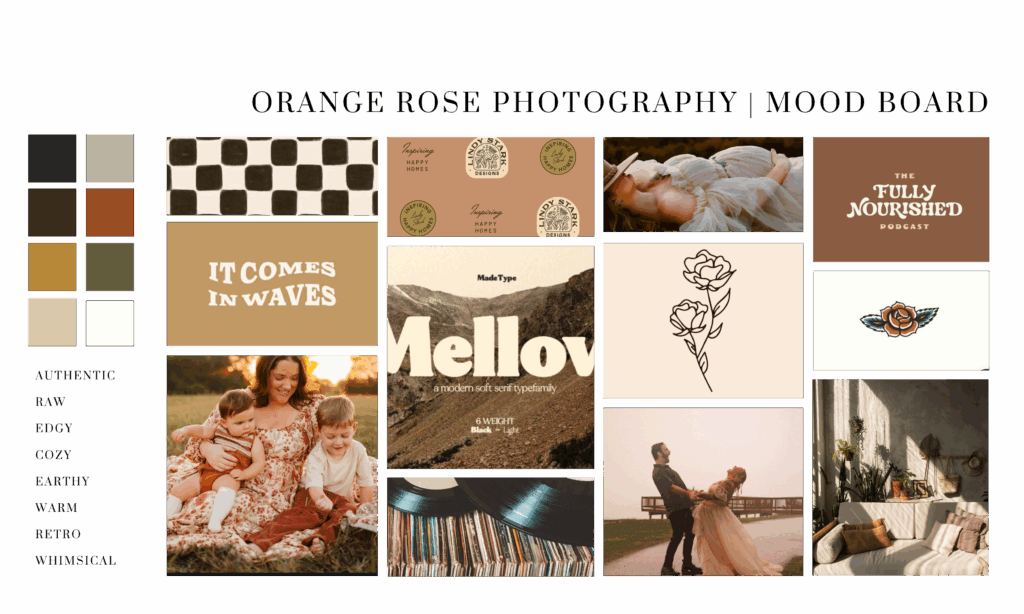
We kicked things off with a strategy call to understand Morgan’s heart for her business. She described her ideal client as families who want movement and storytelling over posed perfection. During this call, she also shared her love for moody, retro vibes and the earthy tones of nature—a perfect foundation for creating authentic branding that truly felt aligned with her values.
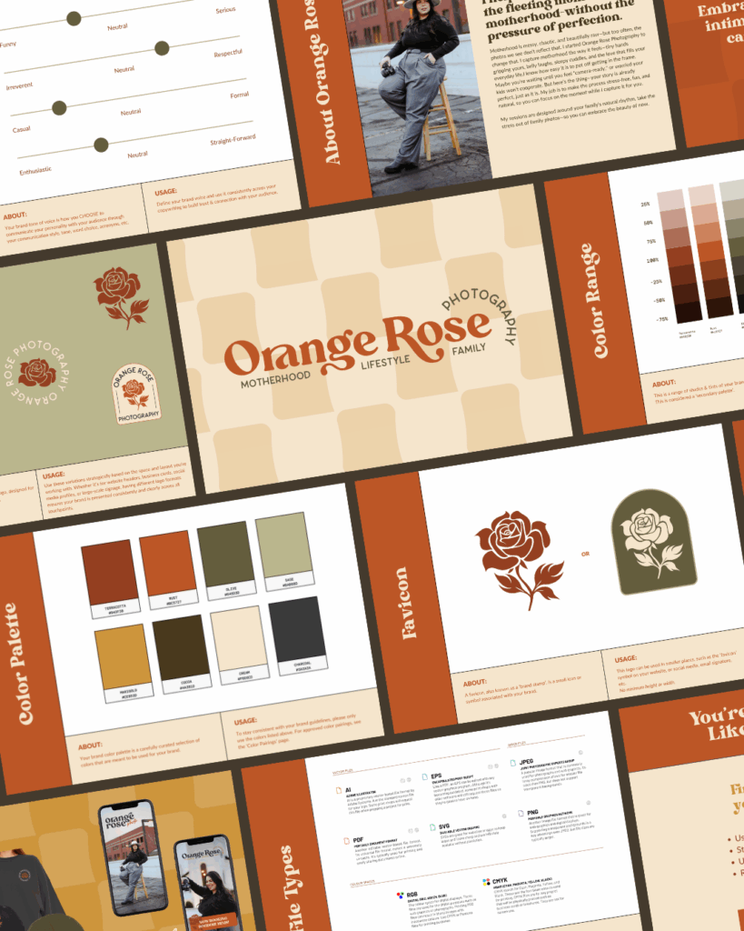
From there, our team curated a mood board that leaned into a retro-70’s aesthetic, rich in warm neutrals and grounded by deep, organic hues. The goal was to capture that nostalgic, cozy energy that makes Orange Rose Photography so distinct. Morgan immediately fell in love with the direction—it felt like a true reflection of her personality and artistry.
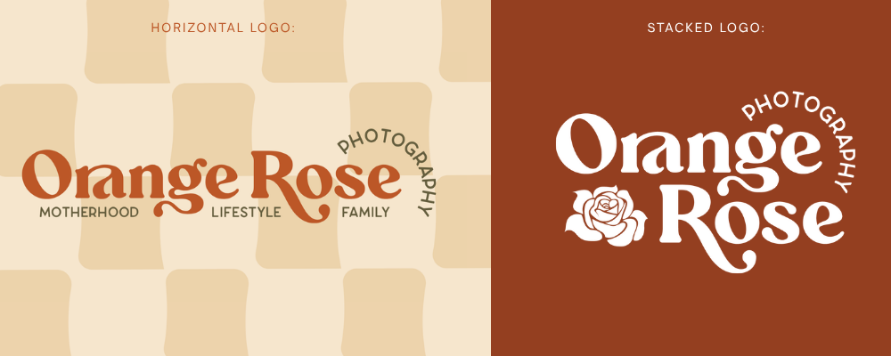
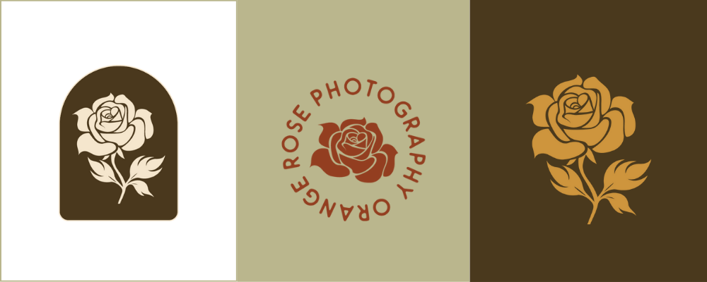
Once the mood board was approved, our designers got to work on the branding assets. We drew inspiration from Morgan’s Florida roots to bring subtle nods to her business name, using an orange rose element as a meaningful accent in her logo and submark. The result was a bold yet cozy visual identity that communicates trust, creativity, and connection—an authentic brand that attracts families seeking genuine emotion in their photography experience.
The Final Brand
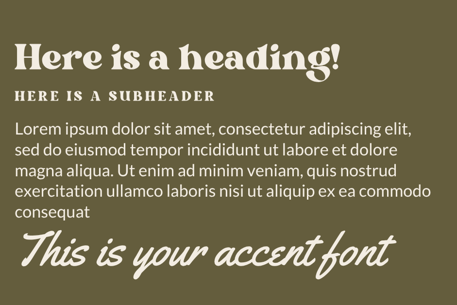
The finished brand feels effortless yet intentional. The palette and typography embody warmth and storytelling, while every detail—from logo marks to textures—was chosen to support that vision of authentic branding. Now, Morgan’s brand and website align beautifully with the kind of work she delivers: heartfelt, whimsical, and full of life.
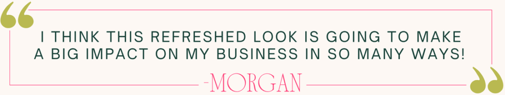
Morgan had a great experience! Here is what she said about working with us:
“Just do it. Seriously, it was one of the easiest and clearest decisions I’ve made for my business. I even got to talk with Jade herself before booking, and she addressed every concern I had. They have a client portal that lays out exactly what needs to be done, when, where, and how—plus you can check tasks off as you complete them (hello, ADHD-friendly!). Their communication is clear and consistent—I never felt out of the loop—and they stayed on timeline the entire time!” – Morgan
Ready to Create Your Own Authentic Brand that Feels like YOU?
If you’ve been struggling with inconsistency in your brand or feel like your visuals don’t match the heart of your business, our team can help. Let’s craft an identity that feels true to you and connects deeply with your audience. Reach out using our website contact form to get started on your own authentic branding transformation.


comments +